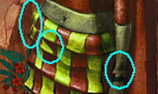
I found a problem with the alignment of some of the visual assets; it isn't a bug per se, but it still belongs here.
When the statue is built, the upper body and the lower body are misaligned; it's easiest to see this at the wrist and hand. The single-color scheme of the statue makes it easy to miss. When I started 'painting' the statue, though, these things jumped out at me.
It's important to note that there's significant overlap between the upper body and the standing statues- the top row of dress panels for instance are entirely duplicated, and the next row is about 50% duplicated. The idea is that the upper body will cover this section on the lower body, and the overlap will ensure that there are no seams.
However, when the statue is built, it's positioned so that it only JUST covers the damaged part of the lower body. I've verified that this issue exists in the unmodified game as well, using the stock visual assets. Here's an image of what I'm talking about.

Edit: Unlike the post in the 'painted statue' thread, which doesn't show these problems, this is an in-game screenshot, altered only to highlight the misalignments.